Probably the best format for your CV is latex.
However, it is in my nature to try to reinvent the wheel.
Why
I was frustrated with the amount of time it took me to adjust my CV for different positions I was applying to, and I didn’t like the idea of trying to maintain several “flavours” of my CV in parallel.
I was inspired by Nick Strayer’s blog on data driven CVs, but I didn’t fall in love with his package. My first attempt at this in Rmarkdown is relatively well documented in the old project repo I made.
I migrated my website from Rmarkdown to Quarto, and at the same time made a lot of improvements on this first attempt. Here, I will give a general overview of the new Quarto set up, but I won’t be compare/contrasting with the old version. The rest of this post will make reference to my Quarto site and CV repo.
You are free to steal anything you see here without attribution (although I appreciate it very much if you choose to attribute!)
Desiderata
- Easy to add and remove activities and customize the CV
- Updates to my website and CV ar made simultaneously, so they’re always in sync
- Nice online and print display
Elements
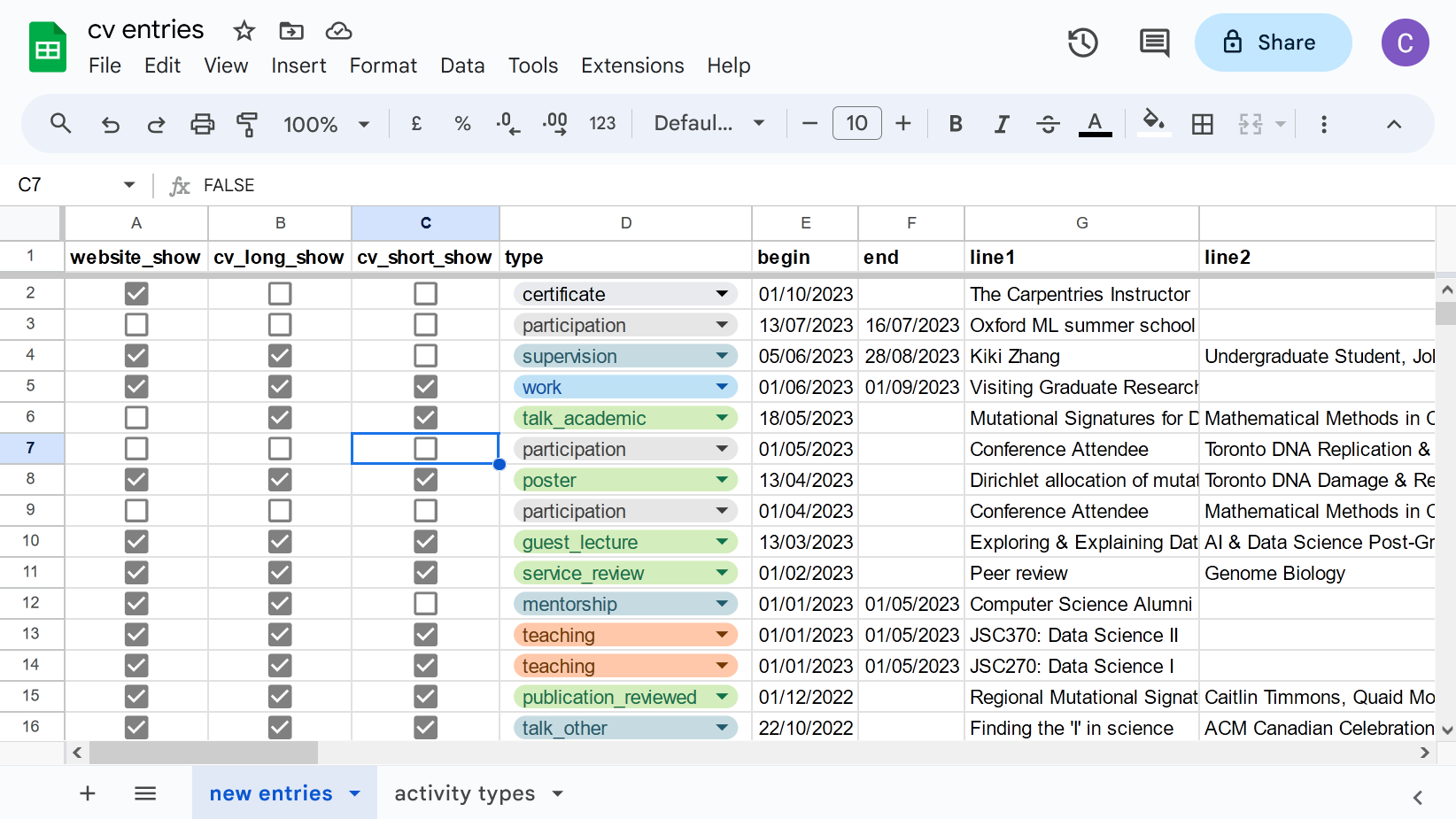
- Google sheets CV spreadsheet
- Quarto website: caitharrigan.ca
- Some funky CSS (I’m still learning)
How it works
1. Each activity entry is read in from my CV spreadsheet.
I add to this spreadsheet whenever I do something (whether it’s particularly notable or not). I have found that there are several activities that I have participated in which, at the time I didn’t think much of but in retrospect were really useful to me in building a record of continued enthusiasm.
For example, I didn’t used to think that the volunteering I did in various mentorship programs was all that interesting - it was just “something I do on the side”. These days, I actively identify myself as a mentor. The spreadsheet is an easy way to recognize the contribution I’ve made and encourages me to keep contributing.
I think even if you don’t use any of the automations I describe here, and choose to manually curate a CV in word or latex, you should consider keeping a CV spreadsheet for yourself.
The CV spreadsheet includes some checkboxes, so that each activity can be included or excluded from the different outputs I might want: my website homepage, my long form CV, my short form CV.
Once read into R, these checkboxes become boolean variables, and I can simply subset the whole CV dataframe to relevant entries as follows:
cv_entries <- cv_entries %>% filter(website_show == T)
See an example of this on my homepage qmd
This achieves desiderata (i): Easy to add and remove activities.
I do some data manipulation at this point. For example any activity that has an end date in the future is changed to “present”. When the end date passes, this is automatically changed to the date once re-rendered. This is nice because it means you can put an estimated future end date and the entry doesn’t have to be manually updated once it passes.
2. Filtering
Each section is created by filtering to the relevant activity type:
cv_entries %>% filter(type=='education') %>% print_section()
Because I filter and render everything all together, I get desiderata (ii) for free: website and CV are always synced because they draw from the same data source at the same time. However, because of the filtering I can customize their contents and they don’t have to be identical.
3. Format
I do some cheeky formatting to make link buttons appear nicely and put everything into custom CSS classes, using the script format_entries.R.
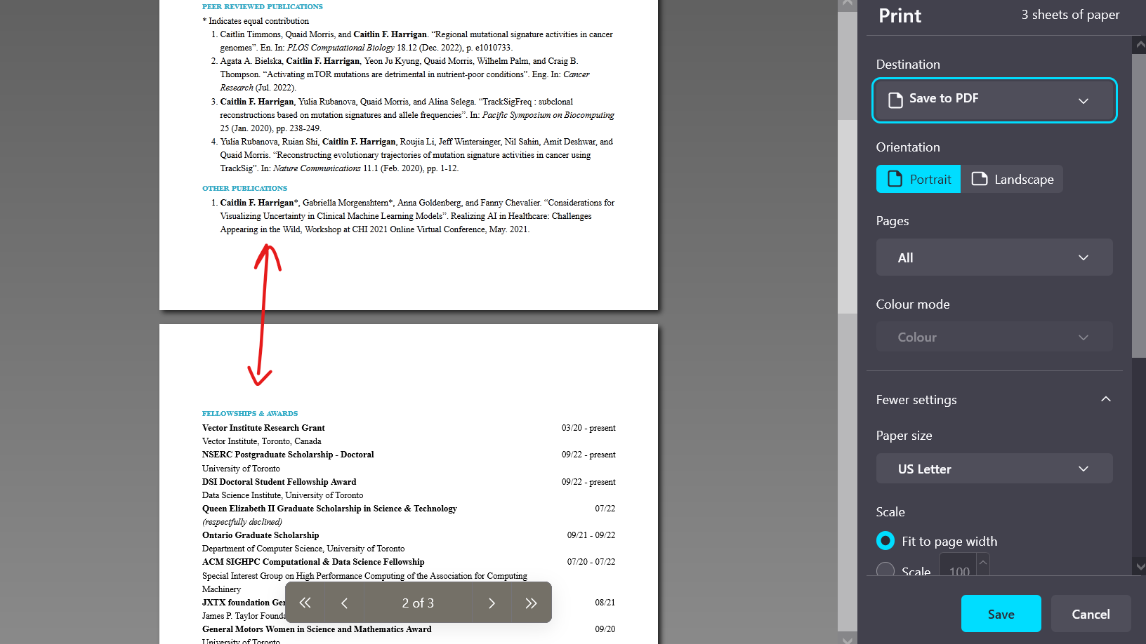
Although Quarto can simultaneously render html and PDF output, I had trouble creating a single .qmd file which could look nice in both formats. The approach I took instead was to use CSS to display entries differently depending on whether it was displayed on a screen, or printing. The process to create the PDF version is to first render to html, then print from browser.
This part was labour-intensive to figure out, and maybe not the best possible use of Quarto. I had to muck around with margins and invisible elements a little to get this to work. But I’m happy with the result! We achieved desirata (iii): Looks nice online and in print 😁
Quirks
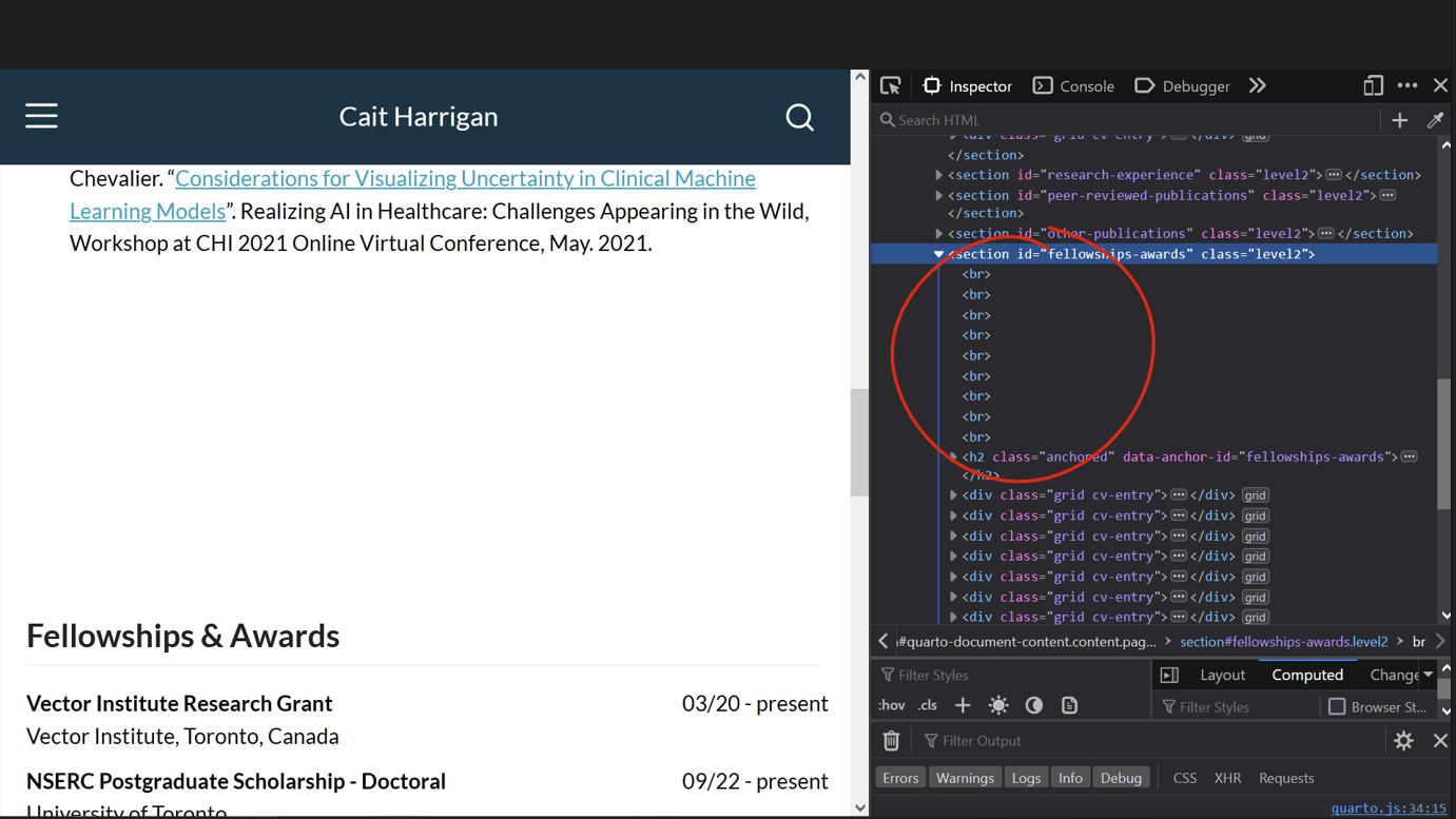
Sometimes pagebreaks are awkwardly placed in the middle of a CV entry. To resolve this, I open up the browser developer tools and insert some <br> until I’m satisfied. This is inelegant, but an acceptable inconvenience for me.
There are two things I format differently from the rest: “Service”, which I squish all into one line to save space, and “Publications”, which on my CV pages I pull out of a .bib file and print using the RefManageR package. On my website homepage, I treat publications as a regular entry. I do this so that the online presentation can use the nice buttons that format_entries.R provides, and the print version contains the whole formatted reference.
The drawback of this is that I have to keep track of publications in two places, my CV spreadsheet and my .bib file. This isn’t the end of the world since publications are updated less frequently. I’m considering replacing this entirely with data pulled off google scholar, but I haven’t found a great way to do this yet. (Maybe the scholar package? Not entirely clear how I would annotate these with links to code, data, etc.)
Conclusions
That’s it! A Quarto website and CV rendered straight from a google sheet. I may have reinvented the wheel but I had fun with it.


